In this article, we will learn how to Excel plot single column as horizontal line. To do this first create single column sample data in Excel and then use Excel Chart feature to plot horizontal line.
Creating single column sample data
Creating Sample Data manually
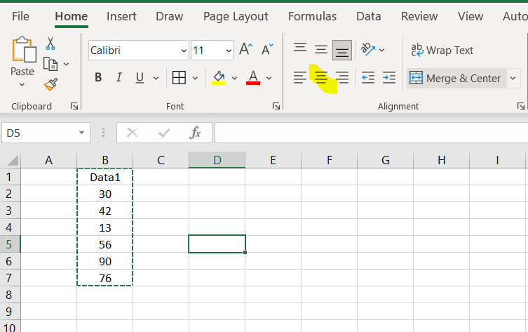
To create sample data manually select any cell say B1, mention a heading say “Data1” as shown below and keep putting numbers manually in the cells. Align the data to center of the column from Home -> alignment (see below image, icon highlighted in yellow) .
Creating Sample Data using RAND() function
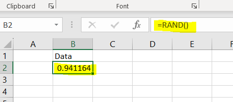
To create sample data using RAND() function. Just right =rand() in any cell and enter. It will show decimal number.
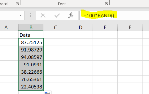
You can now just multiply by 100 to see random number from 1 to100.
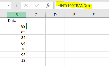
If you notice it’s showing decimal number, Let’s make it an Integer number using INT function.
Plot a horizontal line graph from the data
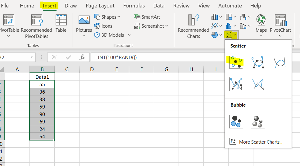
Once the data is created, you need to select the data, Go to Insert -> Chart section and select any chart.
After selecting any plot, you see the Data is plotted as shown in below picture. If you select the graph image, you see three icons will appears.
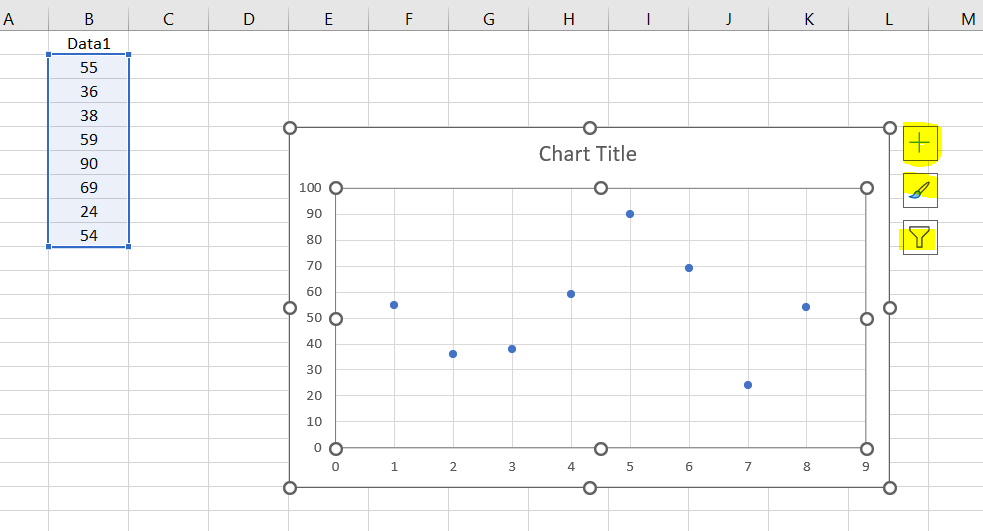
You can see the Y-Axis shows our data but X-axis shows 1-9 and we just want to plot Single column data showing under header Data1. Let’s first Exhange the Axis . Select the Filter icon and then click on select data link showing at the bottom.
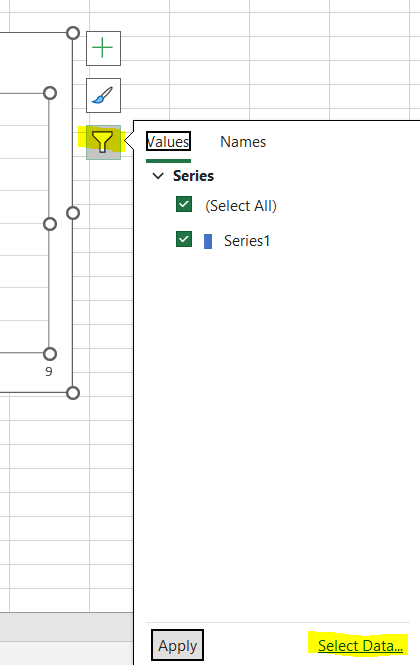
It will open a dialog box, where you have to keep Series1 checked and click on edit.
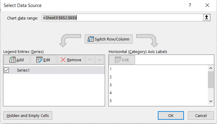
It will open a small dialog box as shown below :
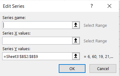
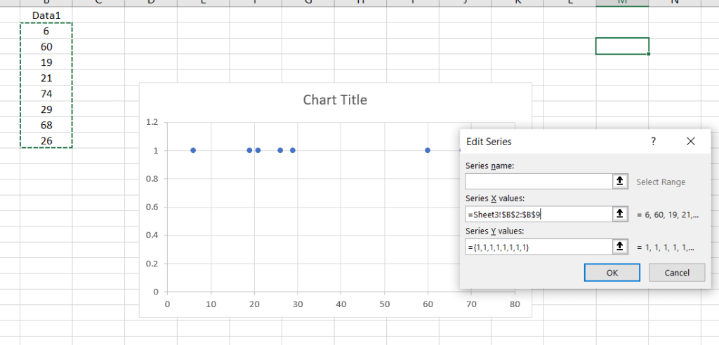
If you see “Series Y value” is the showing the data . We have to make our data as “Series X values”. For that click on the input box showing just below “Series X value” and just mention {1,1,1,1,1,1,1,1} 8 1’s like this so plot all of our data in single line horizontally along x-Asix.
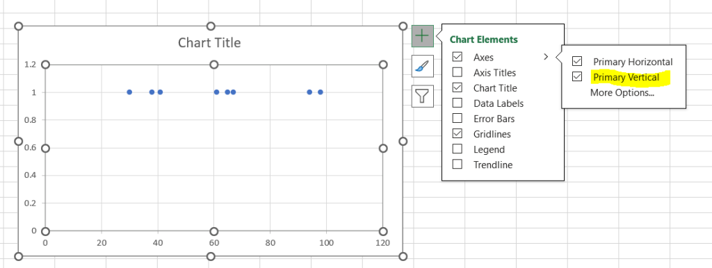
Click OK and see the change in the graph. You can see below that our Single Column data is now plotted horizontally parallel to X-axis. We don’t need to show anything in y-Axis, and to remove that, click on plus icon -> Axes -> uncheck “Primary Vertical” .
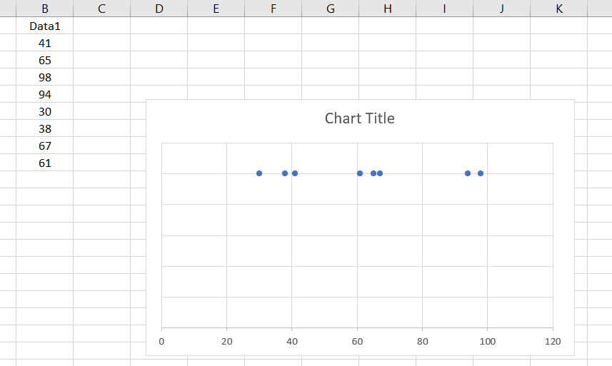
You will notice that our single column data is now showing correctly plotted horizontally as we were looking for.
If you have any query on above Article , please comment below or Contact Us. We will be happy to assist.
Want to Learn How to use ChatGPT in Excel? See some useful information here: Business Apps – Microsoft AppSource